CREATING A MINIMALIST LOOK IN EVERY ROOM OF THE HOME
.jpg)
There is no denying that minimalism is having a moment right now. The minimalist aesthetic, which celebrates sparsity and neutrality, is influencing everything from fashion to interior design. We’re big fans of the elegance that a simple interior embodies, and we’re not alone. Research shows that an uncluttered, bright, and open space even has positive effects on your well-being.
We asked our expert Jennifer Mota, Consultant to Architects and Designers, about her thoughts on the minimalist trend, how its evolving, how customers are using it, and which tiles are great picks to achieve the trendy look.
How does the trend of minimalist translate into tile products?
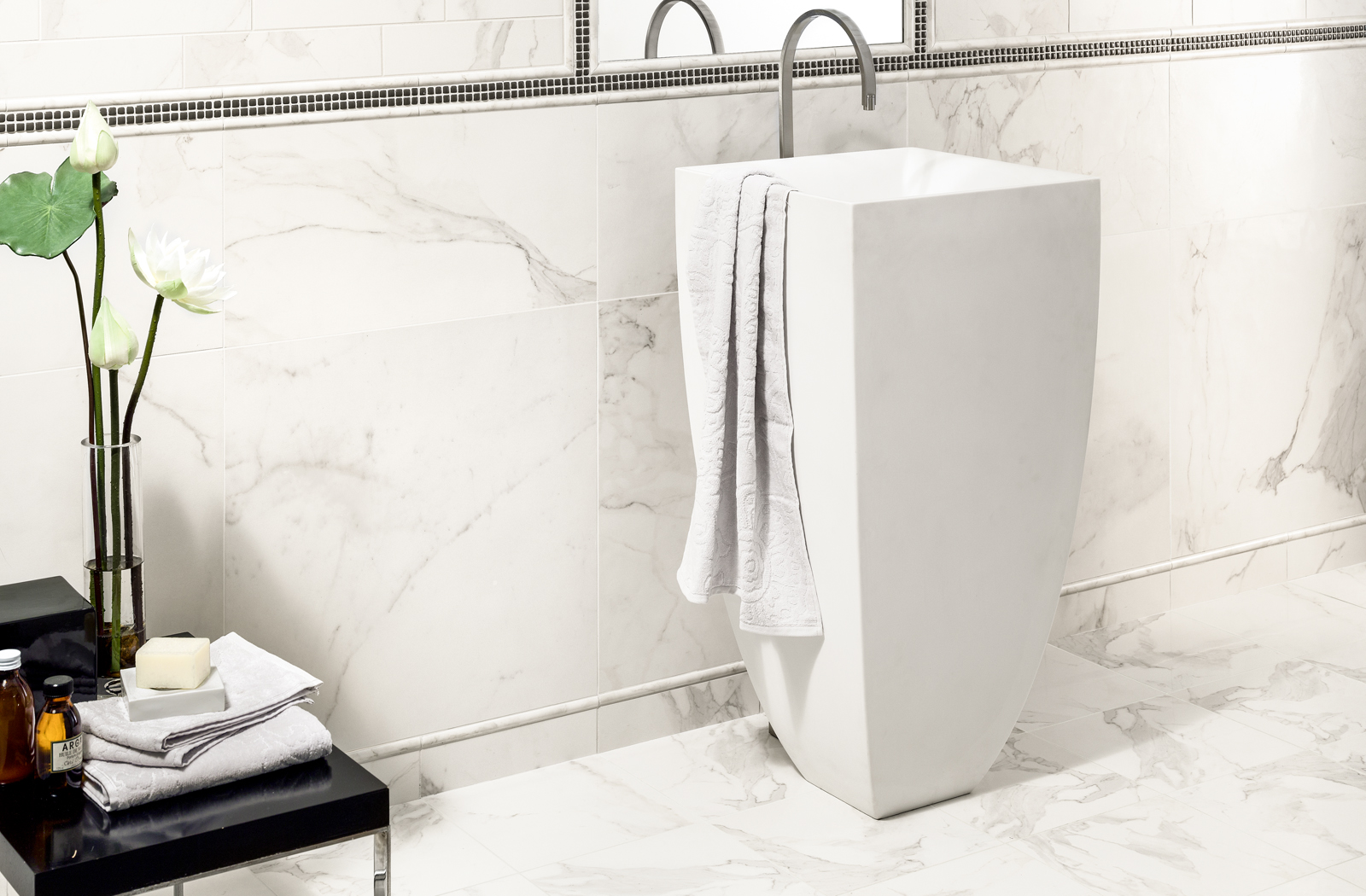
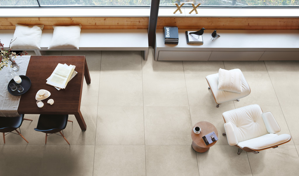
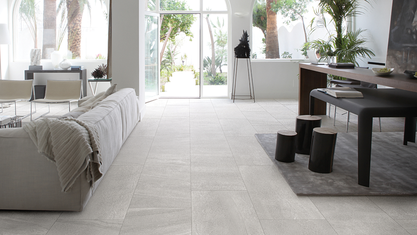
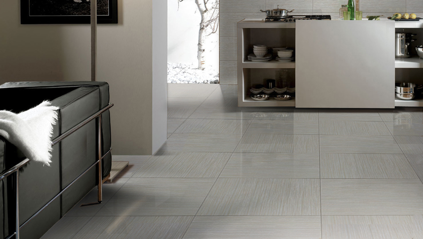
As minimalist designs tend to have an emphasis on open space, the floor and wall applications have a significant impact on the overall design. So, as these specific designs are becoming more common, tiles have seem to veer in that direction as well. We see many more products available in larger formats, subtle patterns and solid colours that contribute to the very exposed and organized look that minimalist designs evoke.
Do you see it on the rise or decline in spaces/among customer requests?
I believe the concept of minimalism is very popular at the moment and based on current projects it seems that it will continue this way for some time. As we all know, design trends come and go but I believe the functionality of a minimalist design really enforces its continued presence in the the industry.
Is minimalism synonymous with white?
Definitely not. Although a predominantly white or even white and black concept can be common for a minimalist design, it is not a limitation to achieve that type of a look. There is no reason you couldn't create a minimalist design while including colour in the space.
Is there a recent project that exemplifies this trend featuring Olympia Tile products? Can you share it with us?
Not to contradict my previous answer, but I recently worked on the head office of a large technology corporation that is moving forward with a completely white, minimalist design. Some of the product they are using are our Unicolour series, Micro Crystal slabs and our metallic Prism series as accents.
Can you share any guidelines or tips on achieving a minimalist look?
I would recommend, although not restricting colour, keep the quantity of colours incorporated minimal. You could even use one color and just incorporate different hues. Keep in mind the size of tile being used, as the quantity of grout joints will have an effect on the overall appearance. Restrict yourself as to what you put in the space. An important attribute to a minimalist design is the open, uncluttered space. Try to think of incorporating only the necessities; less is more.
Below you can find our top choices to create that minimalist feel in every room of your home.
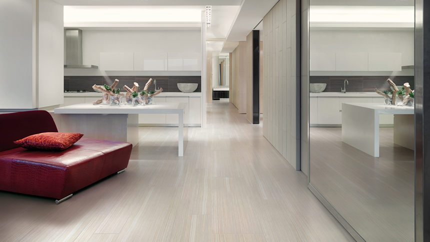
Kitchen
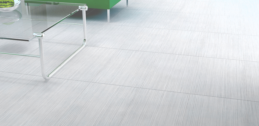
Palma Series - Our Palma series offers a glazed porcelain tile in 7 different colours.
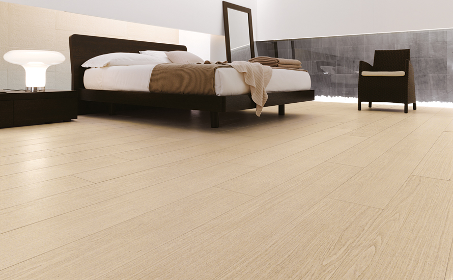
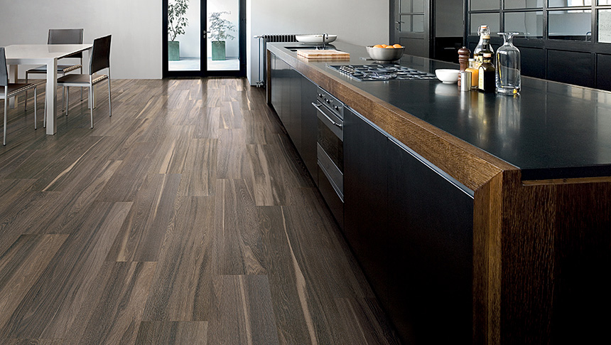
Signum Series - Our Signum Series is a coloured-base porcelain tile, it adds the look of wood grain to your space and is available in 4 colours.
Avenue Series - Available in 4 colours, our Avenue Series replicates the look of Travertine, available in matte and semi polished finishes.
Bathroom
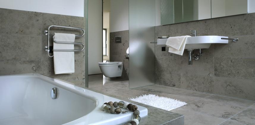
Limestone Series - Available in 4 different finishes, our Limestone Series is a natural stone tile that's great for floor or wall applications.
Stone-SO Series - available 6 colours ranging from light to dark, our Stone-SO series is a glazed porcelain tile that replicated the look of various natural stones.
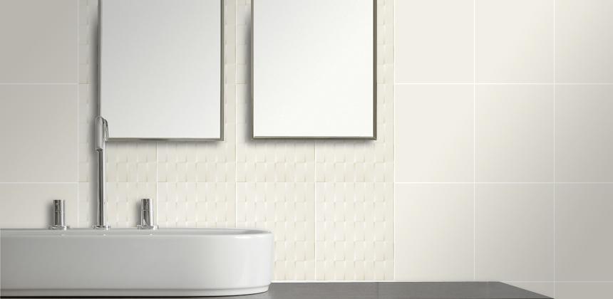
Uniwall & Weave Series - A plain style field tile that has a 'woven' raised profile, which gives a unique 3D effect.
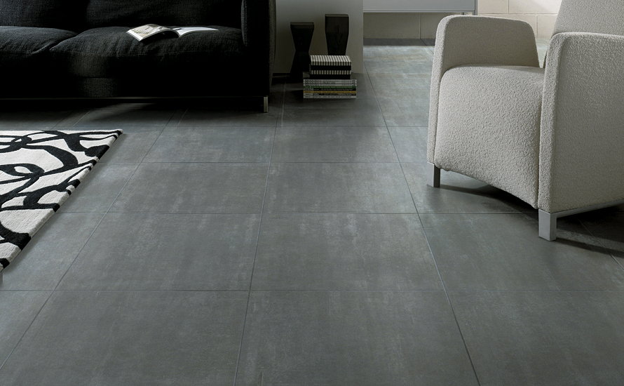
Living Room
Tracks Series - a highly variegated replica of limestone, this coloured-base porcelain tile is available in 4 colours. Seen here in Beige.
Eco-Stone Series - a mixed stone look with a neutral and contemporary colour palette. Available in 4 colours and an interlocking 3D pattern.
Rosedale Series - Great for floor and wall applications, this coloured-base porcelain tile is available in 7 neutral colours.
Dining Room
Cornerstone Series - Available in 3 sizes and 3 beautiful colours, this unglazed porcelain tile is going to be a great fit for any space.
Materia Project series - available in three colours and two finishes: bark - wood pattern with a plank style, crusted - lightly textured finish.
Bedroom
Kerlite Plus Series - This collection of VERY THIN tiles is composed of four styles: ABSOLUTE is a plain coloured style. ELEGANCE is a replica of limestone. EXEDRA is a classic natural stone replica. OAKS is a linear-styled replica of wood. The thickness of these tiles is 0.35 cm.
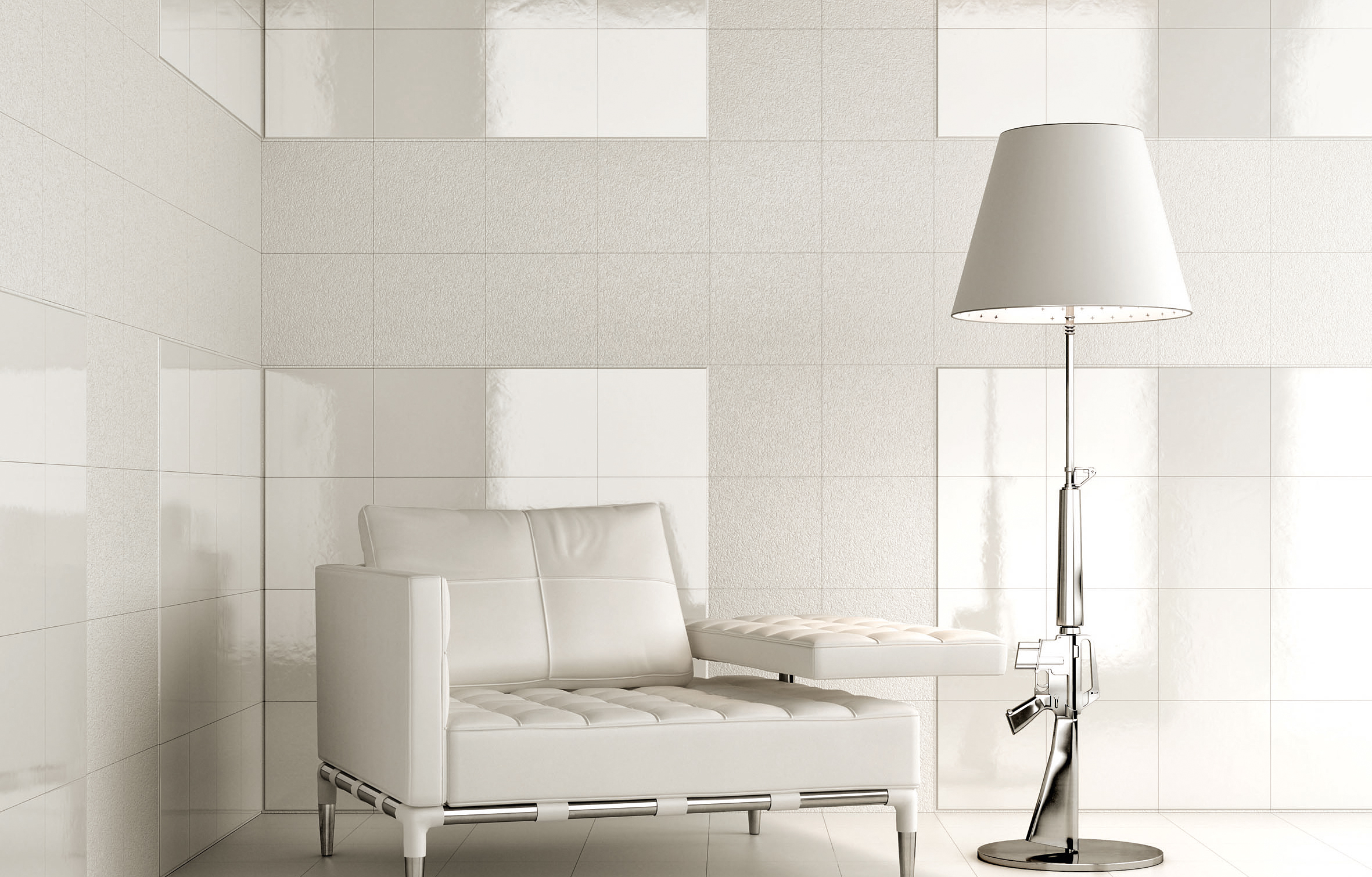
Flexible Architecture Series - a lovely body wall tile line that is composed of different structures and thicknesses for combining patterns and designs. Designed by Philippe Starck.
Waterfall Series - a beautiful porcelain tile, designed with irregular striae in a rippling effect that simulates rivulets of water.
Bonus: Commercial Space
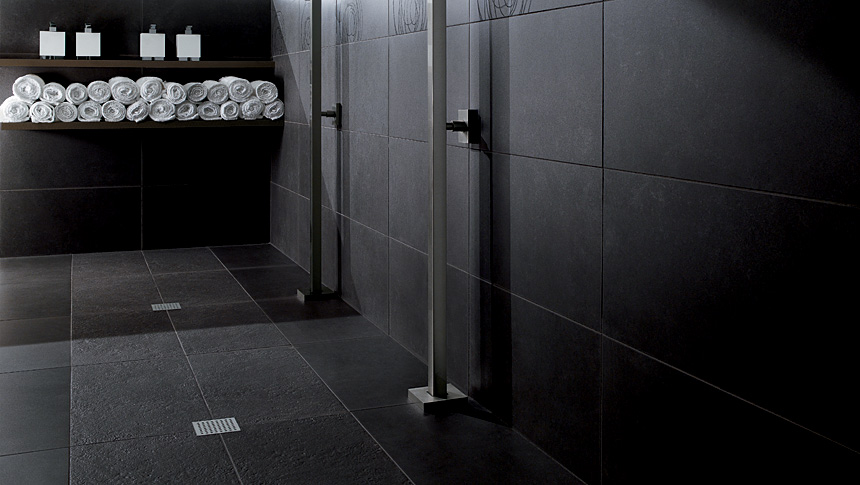
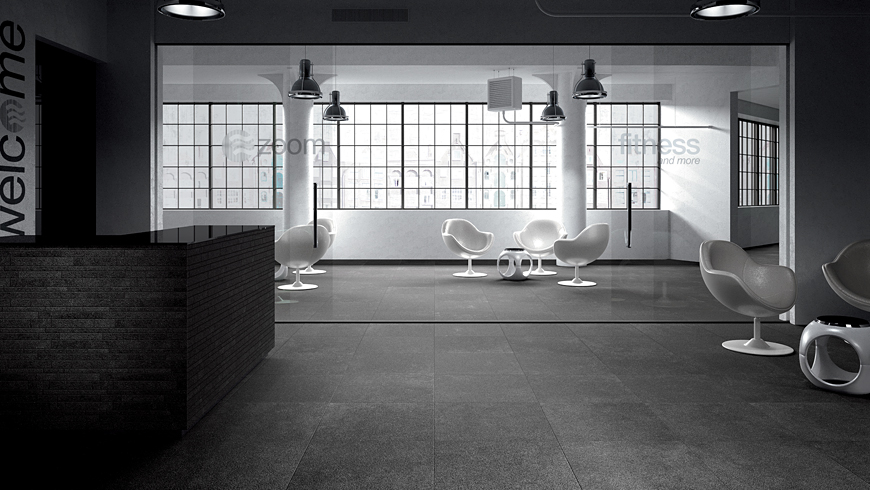
Lab 21 Commercial Series - an unglazed porcelain tile, available in 4 colours.
We hope you enjoyed our post on obtaining the minimalist aesthetic. You can explore more of our products here.
