
WORKING WITH PANTONE'S 2016 COLOUR OF THE YEAR IN YOUR SPACE
The beautiful pale shades of pink and blue have been selected by the colour experts at the Pantone Color Institute as the 2016 Color of the Year. Rose Quartz and Serenity, are a much softer selection than 2015’s Marsala colour. This year’s colours reflect the mindfulness consumers are seeking today, Pantone elaborates: “consumers seek mindfulness and well-being as an antidote to modern day stresses, welcoming colors that psychologically fulfill our yearning for reassurance and security are becoming more prominent”.

We sat down with Olympia Tile research and product development expert Anila Bregasi to discuss the effect this colour selection will have on residential and commercial spaces, as well as the product selection at Olympia Tile.

What do you think about Pantone’s 2016 colour selection?
RoseQuartz is persuasive but gentle tone that conveys compassion and gives warmth to any space. The Serenity shade is airy and weightless, it gives the impression of space, and I am very fond of this colour personally. When these colours are combined, as they are in Pantone’s selection, the warmth of RoseQuartz and coolness of Serenity bring a calmness and comfort to a room.
How do you imagine designers and consumers will integrate the colours into their home or projects?
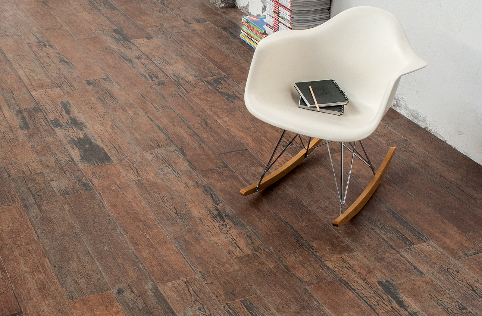
Those colours will undoubtedly be spotted everywhere this year, especially in the beauty and fashion industries. Because RoseQuartz and Serenity are not neutral colours, I see their application in more transient elements of interior decor that can change from season to season, like cushions, curtains, and tabletop decor -- and less in more permanent elements like floor or wall tiles.
Do you foresee any integration in commercial spaces?
I do, but not in complete floor and wall tile applications, rather I could see the RoseQuartz and Serenity shades being used in feature walls - maybe like a mosaic. I would see them being used in more modern spaces, like lobbies of new condos, innovative office spaces, or businesses in the fashion or interior decor industry.
How is Olympia Tile embracing RoseQuartz & Serenity?
We keep an eye on Pantone’s selections every year. This year’s colours are more ‘punchy’ but we do have products that reflect those nuances.
Can you suggest some products that Olympia currently carry that align with these colours?
Yes, we have some products that are similar to the Serenity colour:
-
Color & Dimension series - the Periwinkle close to Serenity
-
DigitalArt series - Denim colours with blues
-
Olympia Tile will be releasing a new series titled Spectrum, which will have a blue colour similar to Serenity.
How does the Pantone Color of the Year typically affect your product selection?
We consider Pantone’s Color of the Year when we do our selection, but it all depends on the colour. We always choose colours that compliment the Pantone colours, because we do tend to see them in different elements of interior design and want to have products that work well with them.
We’re already seeing furniture and accessories inspired by RoseQuartz & Serenity, which Olympia Tile products do you think best compliment spaces where these colours are present?
Roze Quartz
Wall - Color & Dimension, Cristallo, Stilo, Gatineau, Picadilly, Arc
Floor - Micron 2.0, Materia Project, Unicolour
Serenity
Wall - Color & Dimension, Cristallo, Vanity, Stilo, Arc, Flexible Architecture,
Floor - Spectrum, DigitalArt, Micron 2.0, Evolve, Unicolour
See additional inspiration around this year's colour selection on our Pinterest board dedicated to RoseQuartz and Serenity.
To receive more product information and design inspiration, please sign up to our newsletter and follow us on Instagram, Houzz, Pinterest, and Facebook.


