
PANTONE'S COLOUR OF THE YEAR 2017: GREENERY
Each year, the Pantone Colour Institute releases the ‘it’ colour of the year, for 2017 the inspiration comes from nature’s very own neutral: green. The Pantone colour of the year for 2017 is Greenery, a shade that captures the fresh beauty of nature, synonymous with new beginnings and the freshness of the first days of spring.
When we think of green, it’s not typically considered to be the most wearable or versatile colour, but the Pantone Colour Institute provides 10 palettes offering a range of colour combinations with the Greenery shade. It’s trans-seasonal shade that can be paired with neutrals, pastels, metallics, bright and deep tones. We cannot wait to see how it is incorporated in tomorrow’s commercial and residential spaces.
We sat down with Olympia Tile’s Director of Research and Product Development expert Anila Bregasi to discuss the effect Pantone’s colour selection will have on the interior design of residential and commercial spaces, as well as the product selection at Olympia Tile for 2017.
What do you think about Pantone’s 2017 colour selection?
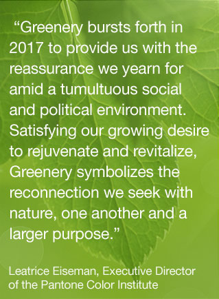
Greenery - The most beautiful color on earth. It’s a message that winter is coming to an end and the refreshing season of spring is approaching. It gives one the desire to reconnect with nature and disconnect from technology, catering to our craving to escape modern society and to head outdoors instead. This color makes us stop and breathe. The Greenery colour is synonymous with all that’s refreshing, renewing, reviving, rejuvenating, restoring, and energetic.
How is Olympia Tile embracing Greenery?
Every year we keep an eye on the Pantone’s selections. This year’s colour is rather bold, but we do have products that reflect this beautiful shade.
How do you envision interior designers will integrate Greenery into their projects?
This color will be spotted everywhere this year, especially in the beauty and fashion industries. I also see this color being used as an accent color in interior decor.
It’s a color that will do well in accent elements such as, natural or artificial pot plants, tabletop decors, wall paint, curtains, etc. I can also see it integrated into more permanent elements such as: wall tiles for bathrooms and/or kitchen backsplashes.
Where do you think we will be seeing more of Greenery in residential designs or commercial designs?
This color will be seen in both residential and commercial designs. Especially as an accent colour appearing in plants, wall paint, accent tiles, and much more.
Can you suggest some products that Olympia currently carries that align with Greenery?
Colour and dimension series, Regal series, and Cristallo.
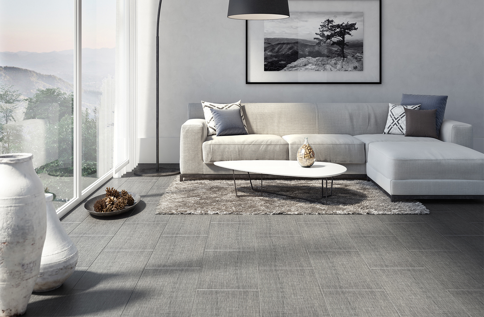
Pictured above: Our Cristallo series tile in the colour 'Taupe'.
To receive more product information and design inspiration, please sign up to our newsletter and follow us on Instagram, Houzz, Pinterest, Facebook and youtube.
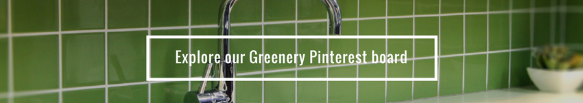
Looking for additional inspiration around the Greenery colour? Check out our Pinterest board.